Niche Guides
What a Barbershop or Salon Website Actually Needs to Book More Chairs
11 Aug 2026 6 min read
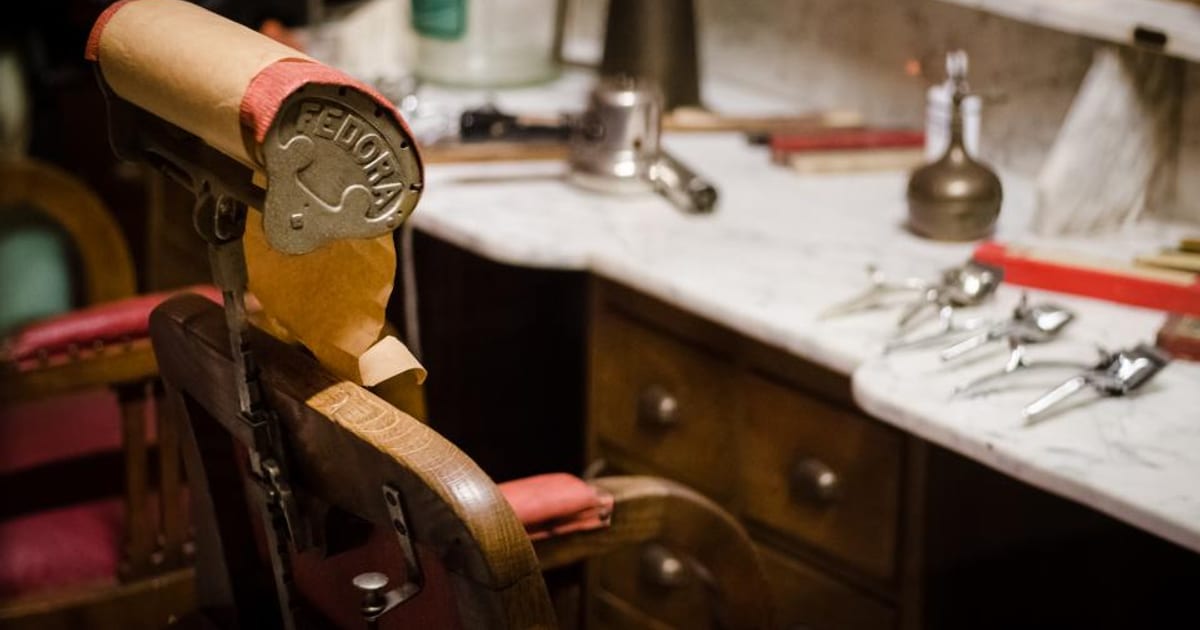
A hair salon or barbershop is one of the easiest businesses to sell visually — the work speaks for itself in a way a plumbing job never quite can — and yet a large share of salon websites still fail at the one job that actually matters: getting the visitor to book an appointment before they close the tab and move on to the next option in their search results.
Booking has to be the first action available, not a page three clicks deep
The single most common mistake on salon and barbershop websites is burying the booking option behind a "Contact" page that requires filling in a form and waiting for a callback. A customer comparing three or four salons in the same evening will book with whichever one lets them pick a time slot immediately — an online booking widget visible on the homepage, ideally above the fold, removes the single biggest point of drop-off in the entire site.
If a full booking system (Fresha, Treatwell, Booksy, or similar) isn't yet in place, even a simple "Book via WhatsApp" button that opens a pre-filled message is a meaningful improvement over a plain phone number, because it matches how a large share of especially younger customers actually prefer to make contact.
The photo gallery needs to be recent, specific, and well lit
Salon websites almost universally have a gallery, but the quality and recency of it varies enormously — old photos from years-old styles, inconsistent lighting between shots, or a gallery that hasn't been updated since the site launched all quietly signal that the business isn't currently thriving, even when that's not true at all. A gallery refreshed regularly with genuinely recent work, shot in consistent, flattering light, does more to build trust in a stylist's current skill than any amount of written copy about experience or qualifications.
Organising the gallery by service type (colour, cuts, barbering, treatments) rather than one long unsorted scroll also helps a visitor find proof relevant to the specific service they're actually considering booking, rather than making them dig through unrelated photos to find it.
Individual stylist pages build trust that a generic team page doesn't
Customers choosing a salon are very often choosing a specific person, not just a business — word of mouth in this industry travels by stylist name far more than by salon name. A website that gives each stylist their own short page, with their own specialities, their own portfolio of recent work, and ideally the ability to book directly with them, converts noticeably better than one that lists staff names in a single paragraph with no individual detail.
This also gives existing loyal clients a specific, shareable link to send friends ("book with Sarah here") rather than a generic salon homepage, which meaningfully helps word-of-mouth referrals convert into actual bookings rather than good intentions that fade before the friend gets round to calling.
Pricing transparency reduces a specific, common source of hesitation
A significant share of potential salon customers hesitate to book anywhere pricing isn't visible, simply because walking in blind to an unknown cost feels risky, particularly for services like colour or extensions where prices vary widely. A clear, even approximate, price list removes this specific hesitation and tends to filter in customers who are comfortable with the price range rather than customers who book, discover the price, and feel unpleasantly surprised at checkout — a bad outcome for both sides.
Where exact pricing genuinely varies too much to list precisely (colour correction, for instance), a clear "starting from" price paired with an easy consultation booking option strikes a reasonable balance between transparency and the reality that some services can't be priced without seeing the client first.
Reviews specific to individual stylists, not just the salon overall
A generic five-star rating for the salon as a whole is useful, but reviews that mention a specific stylist by name carry more weight for a new customer trying to decide who to book with, particularly at a multi-stylist salon. Encouraging clients to mention their stylist by name when leaving a Google review, and featuring a few of these specific mentions on the relevant stylist's page, gives new customers the same kind of specific social proof that word-of-mouth referral naturally provides.
Mobile experience matters disproportionately in this industry
Salon and barbershop bookings happen overwhelmingly from mobile devices — customers browsing Instagram, seeing a post, and immediately checking availability from their phone in that same moment of interest. A website that's slow to load, has a booking widget that's awkward to use on a small screen, or requires zooming in to read prices loses a disproportionate share of exactly the impulse bookings that salons rely on. Testing the entire booking flow, start to finish, on an actual phone rather than just checking it "looks fine" on desktop is a worthwhile five-minute exercise that catches problems a desktop review never would.
See what this looks like when it is built
Real websites and the systems behind them, for businesses like yours.
See our work